Designing a cohesive mortgage experience across borrower and lender experience
CoreLogic & Roostify
2023-2025
As the sole designer, I led the end-to-end UX for the 3 core mortgage product lines and design system, covering both borrower and lender platforms during an acquisition transition. Redesigned workflows to streamline processes, reduce loan origination time, and improve transparency and responsiveness.
3 Product Managers
15 Engineers
Lead Product Designer at Roostify
Senior UX Designer at CoreLogic
(Roostify was acquired by CoreLogic)
Product Design
Interactive Prototyping
User Research
Usability Testing
2023-2025
↑15% vs. industry baseline rate
with peaks of 950+ logins/day
through 200 lending institutions

The mortgage process has long been known for its complexity and tediousness, endless paperwork, fragmented systems, and a lack of transparency between borrowers and lenders. Each step, from application to closing, involves multiple stakeholders, compliance checks, and repetitive manual tasks that often lead to confusion and delays.
This project was aimed at simplifying one of the most complex financial processes from borrower application to lender workflows. During this period, my previous company transitioned from a startup product into an enterprise-level digital mortgage platform, leading to a strategic shift to ‘shift left’ and evolve the product into a digital point-of-sale (POS) system that serves as the front door to the mortgage experience.
Unified Journeys
The borrower and lender experiences felt like two platforms
• Inconsistent patterns
• No design system
• Fragmented communication
• Created a unified, scalable design framework and system that aligned borrower and lender products under a shared visual language and interaction model, ensuring consistency and efficiency across platforms.
• Established cross-journey mapping workshops to identify overlaps and pain points.
Business’s Compliance
Product and legal teams needs
• Extensive data collection
• Disclosures
• Verification steps
User's needs
• Simple and guided
• Low-friction experience
• Created a unified, scalable design framework and system that aligned borrower and lender products under a shared visual language and interaction model, ensuring consistency and efficiency across platforms.
• Established cross-journey mapping workshops to identify overlaps and pain points.
Acquisition
The team faced intense pressure to accelerate delivery and demonstrate product value within a short timeframe.
• Created a unified, scalable design framework and system that aligned borrower and lender products under a shared visual language and interaction model, ensuring consistency and efficiency across platforms.
• Established cross-journey mapping workshops to identify overlaps and pain points.
Sole Designer
I was the sole designer responsible for 4 interconnected projects
• App Capture
• Borrower Portal
• Lender Portal
• Design System
Balancing multiple priorities across these products required strong organization, cross-functional alignment, and the ability to think at both the system and feature levels.
• Created a unified, scalable design framework and system that aligned borrower and lender products under a shared visual language and interaction model, ensuring consistency and efficiency across platforms.
• Established cross-journey mapping workshops to identify overlaps and pain points.
① App Capture - Borrower Information Intake
② Borrower Portal - A Guided Mortgage Workspace
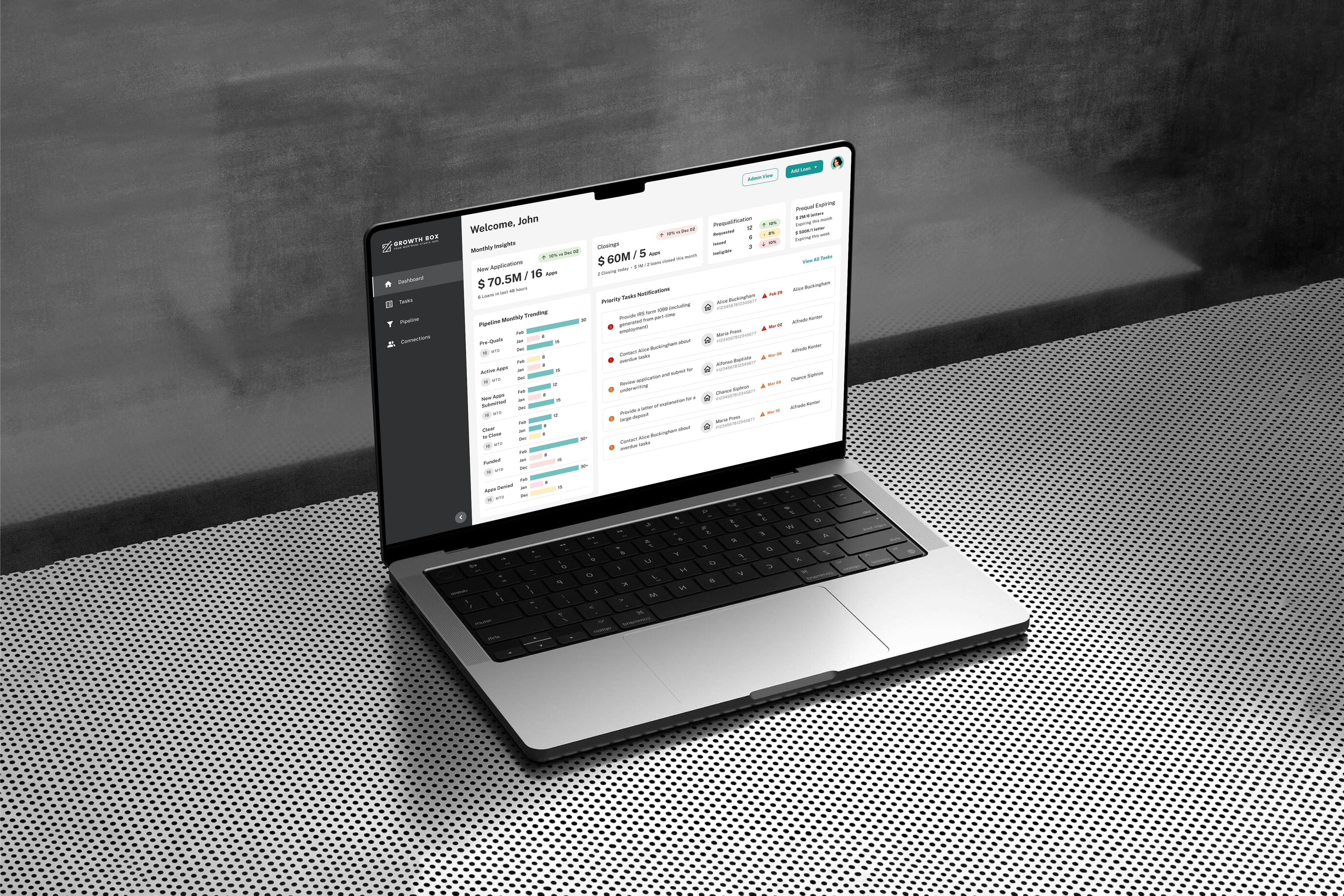
③ Lender Portal - Task & Pipeline Management for Loan Teams
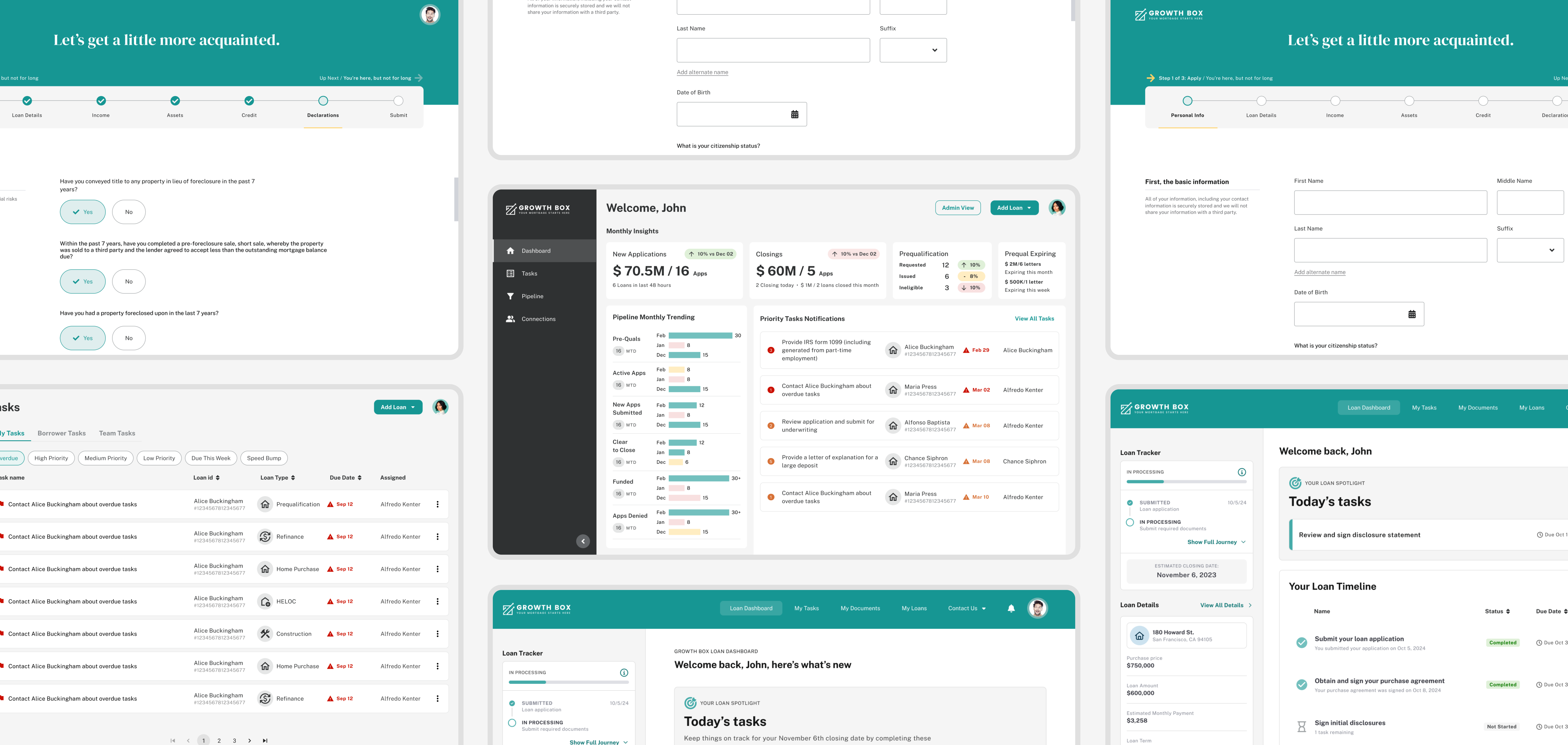
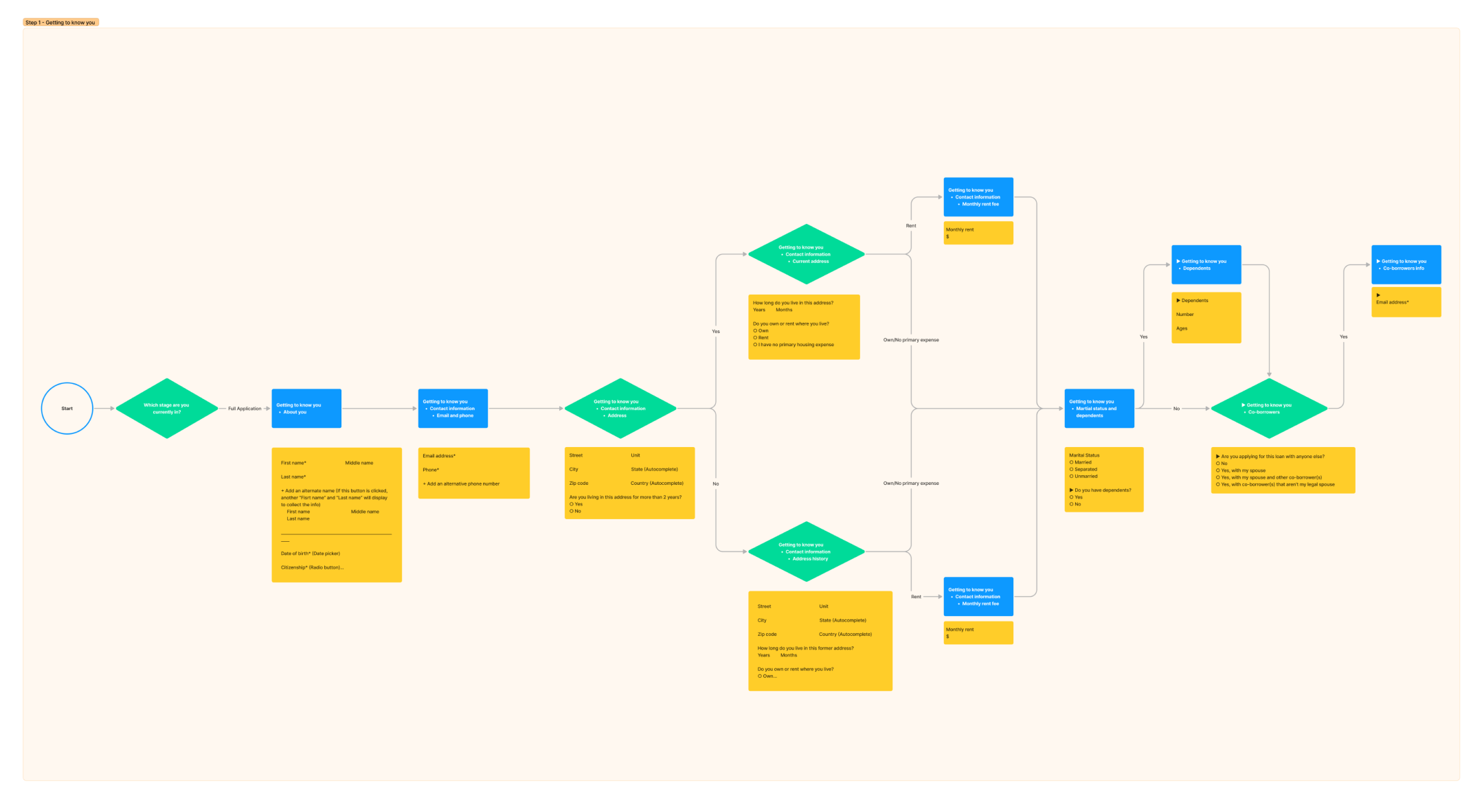
App Capture is the borrower’s entry point where personal and financial information is collected to begin an application. As the first touchpoint, it needed to balance strict compliance requirements with a simple, reassuring experience that could support multiple workflows. I designed 5 distinct workflows including Home Purchase, Prequalification, Refinance, HELOC/HELOAN, and Construction.
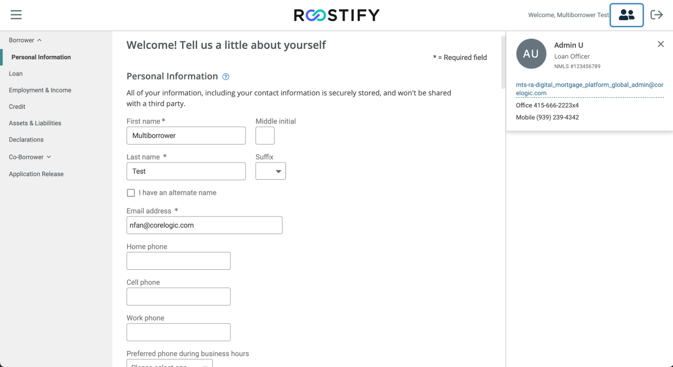
• Outdated left-hand sidebar that felt cluttered for borrowers
• Left-hand sidebar behaved like a dashboard menu that is ineffective for guiding a linear application flow
• Layout was not mobile-friendly, making applications difficult to complete
• Poor mobile experience contributed to high drop-off rates early in the funnel
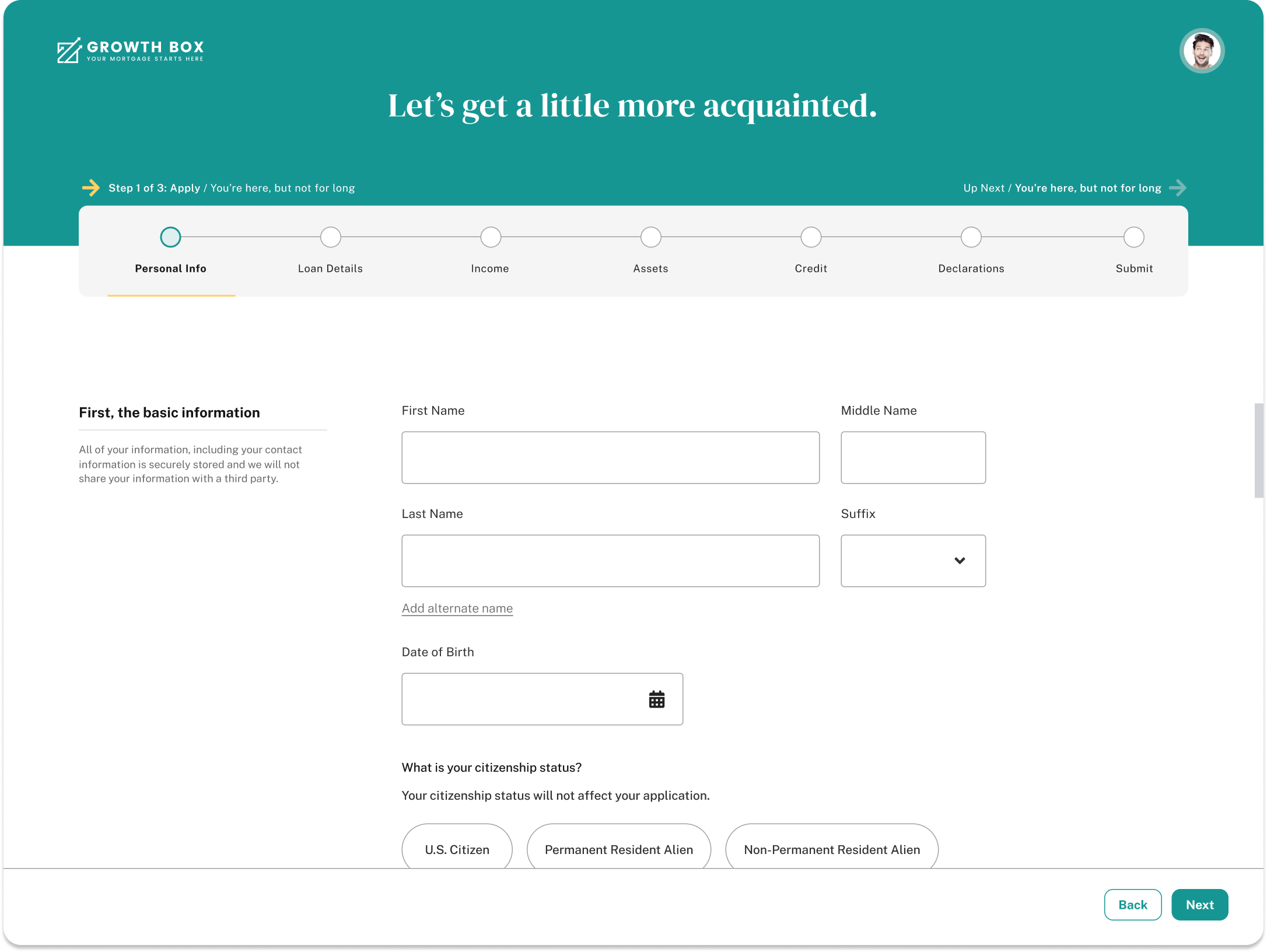
• Replaced the static sidebar with a clear step-by-step progress tracker
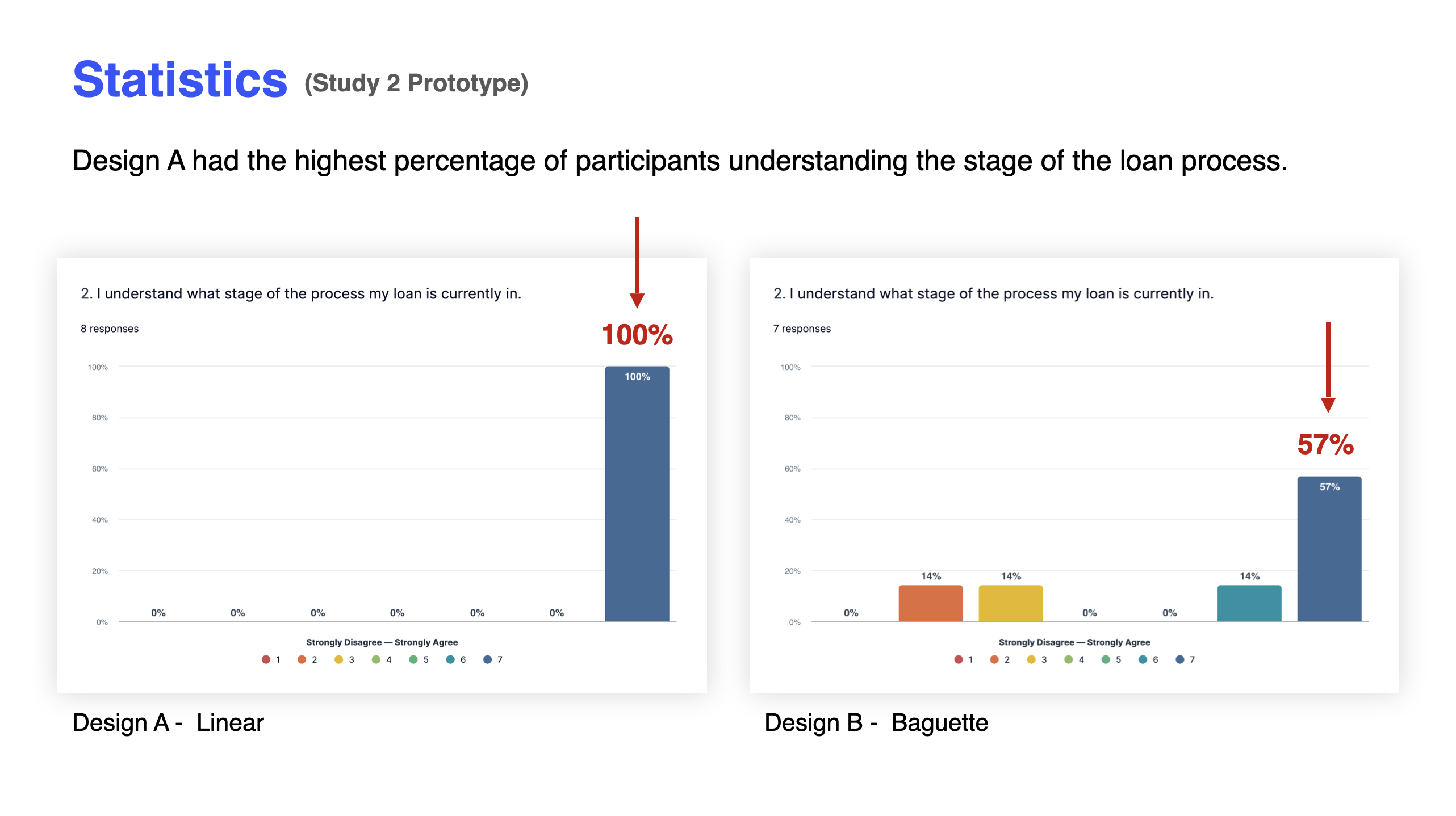
• Created wireframes and ran A/B tests to validate which tracker design reduced uncertainty for borrowers
• Integrated strict compliance requirements by mapping the URLA form directly into the App Capture flow
• Introduced progressive disclosure to avoid overwhelming borrowers with unnecessary information
• Implemented responsive layouts for a seamless experience across devices
• Added role-appropriate guidance to keep borrowers focused while supporting regulatory accuracy
To ensure the application experience met regulatory standards, I mapped the entire URLA form into a structured user flow. Working closely with compliance partners, I clarified data rules, dependencies, and required disclosures.
The product team advocated for the Linear tracker, but leadership favored the Baguette version. We conducted A/B testing to compare both. Testing revealed that the Linear design delivered higher clarity, confidence, and completion rates, confirming it as the stronger solution.
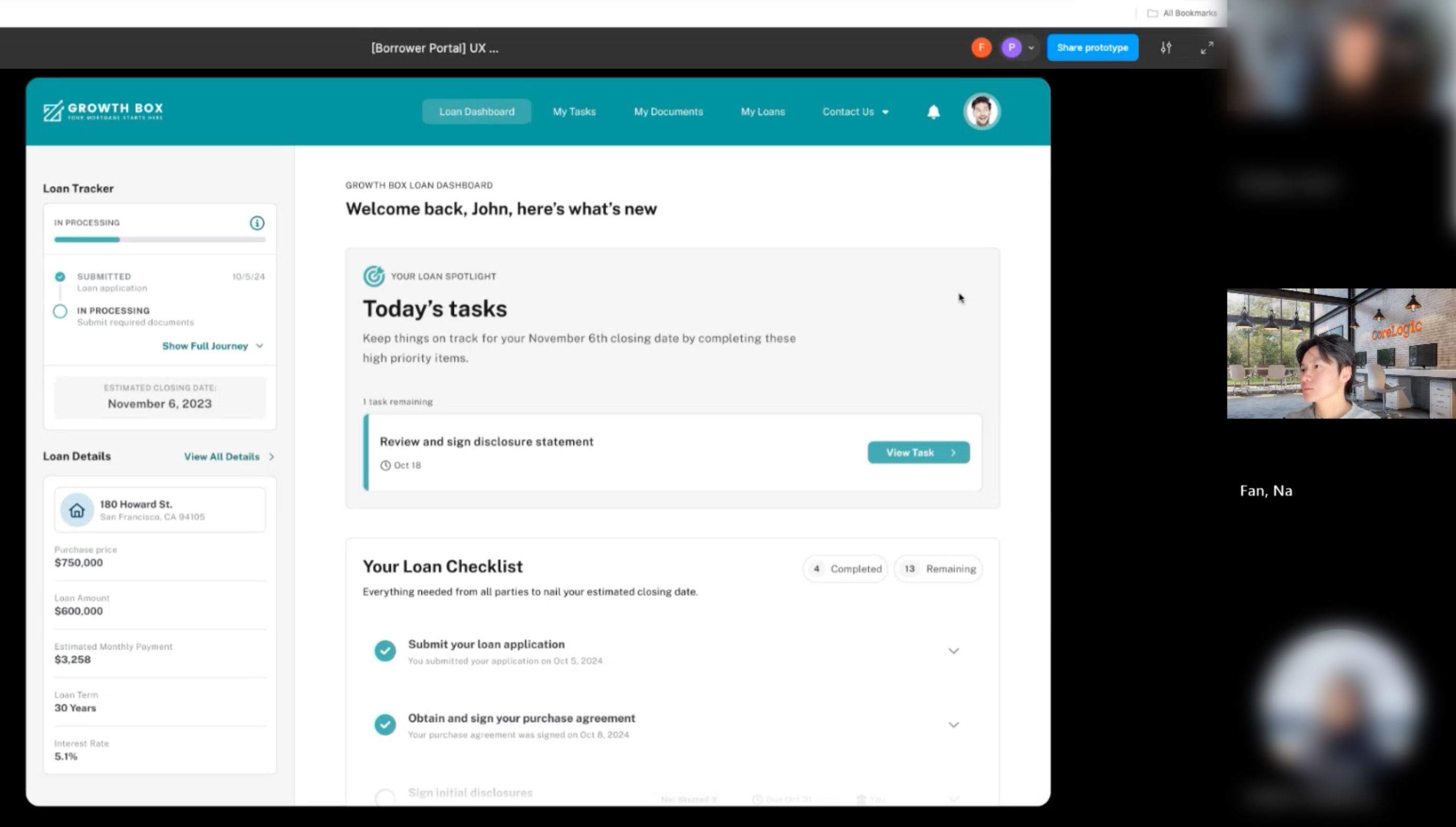
The Borrower Portal is the borrower’s hub for tracking progress. The challenge was to have an intuitive space that reduced anxiety and provided transparency throughout the mortgage journey.
• Visually inconsistent with App Capture (fonts, colors, and components).
• The mismatched styles made the two experiences feel like disconnected products.
• Features were presented in ways that created confusion rather than clarity for borrowers.
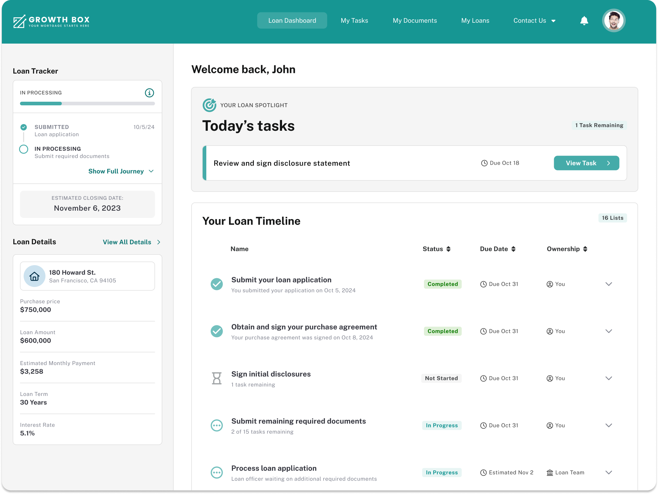
• Restructured key features for greater clarity and transparency in the loan process.
• Redesigned the loan tracker to clearly show progress, milestones, and closing dates.
• Added a spotlight section to highlight the most urgent borrower tasks.
• Consolidated the task list into a streamlined, step-by-step checklist.
• Introduced notification and communication preferences to give borrowers more control.
• Explored a conceptual notification panel to centralize updates and reduce confusion.
• Made the entire experience fully responsive for both desktop and mobile.
After designing the initial Borrower Dashboard, we ran usability testing to confirm whether the direction matched real user needs. This early validation helped us avoid misalignment and prevented wasting future engineering and design resources on the wrong approach.
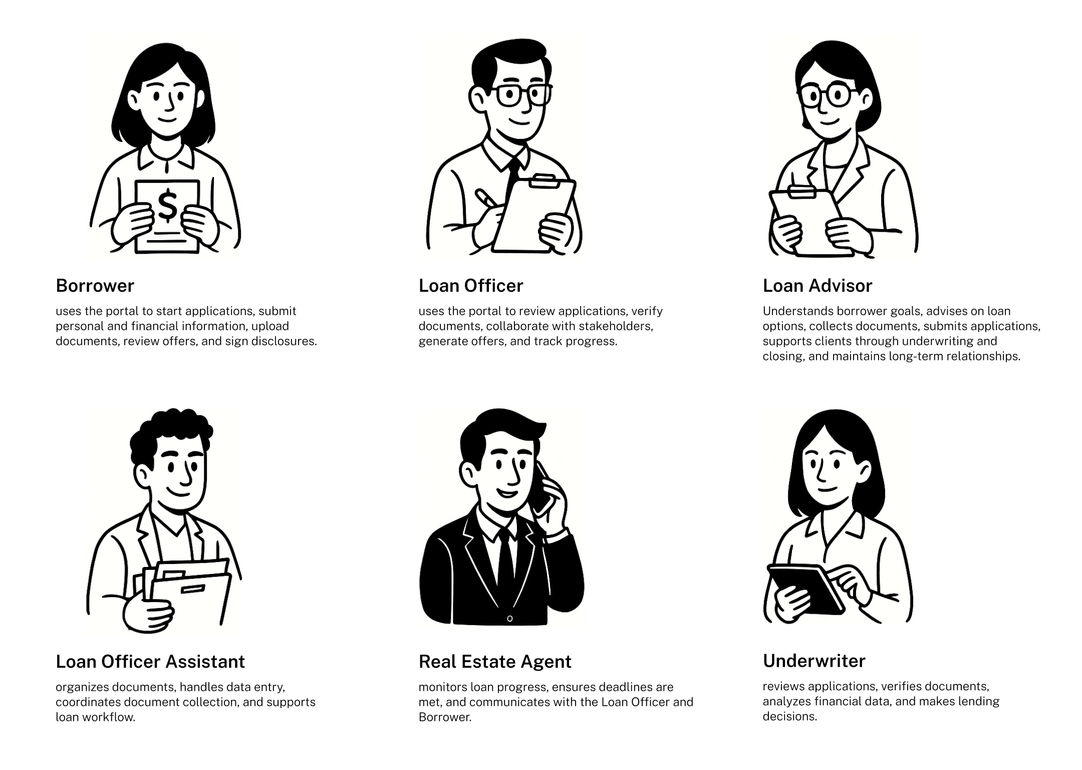
6 personas to reflect the diverse roles involved in the mortgage lifecycle from borrowers submitting applications to loan officers, advisors, and underwriters managing reviews and approvals. These personas highlight the distinct needs and responsibilities.
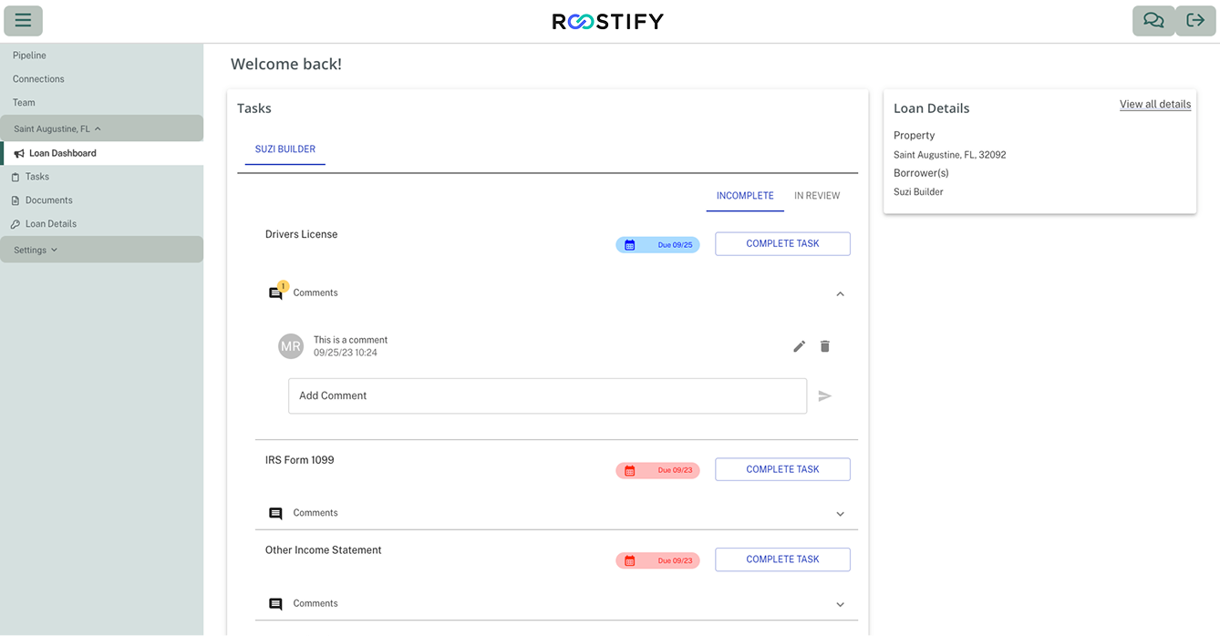
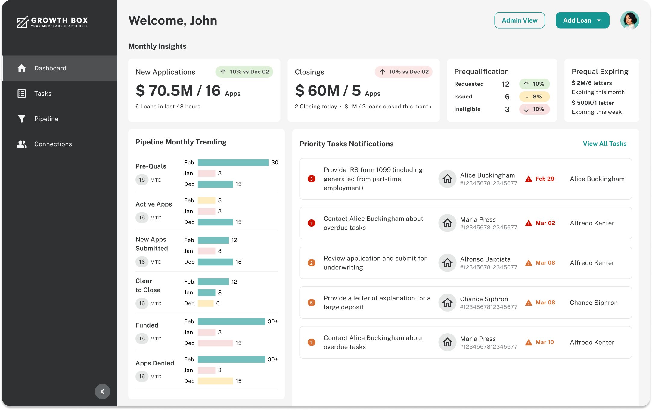
Loan Officer Portal is a streamlined workspace designed to be intuitive,
reduce clutter, prioritize key tasks, and automate processes wherever possible to improve efficiency.
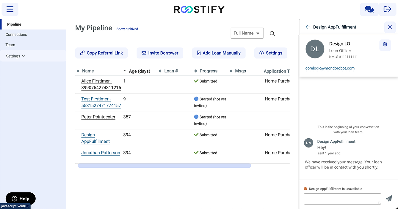
• The original Loan Officer Portal was familiar to existing users but lacked structure and hierarchy.
• Key actions were not clearly prioritized, making efficient workflows difficult.
• Information appeared at the same visual level, creating cognitive overload.
• The cluttered pipeline view made it hard to scan and interpret tasks quickly.
• Content organization was confusing, with settings split across account-level and layout-level sections.
• These issues slowed workflows, created ambiguity, and limited scalability—especially for newer loan officers and enterprise clients expecting a modern, streamlined experience.
• Synthesized insights and collaborated with leadership and product management to define the MVP and determine what would deliver the most impact within timeline and acquisition constraints.
• Established a North Star vision for the redesigned portal: a streamlined, intuitive workspace that reduced clutter, prioritized key tasks, and automated processes.
• Designed the experience to support both user and business goals — faster onboarding for new agencies, reduced cost to originate a loan (~$10k historically), and shorter processing/closing times.
• Included guided workflows and educational cues to support less experienced loan officers and assistants.
• Rethought task prioritization, consolidated workflows, and integrated automation to improve daily efficiency.
6 personas to reflect the diverse roles involved in the mortgage lifecycle from borrowers submitting applications to loan officers, advisors, and underwriters managing reviews and approvals. These personas highlight the distinct needs and responsibilities.
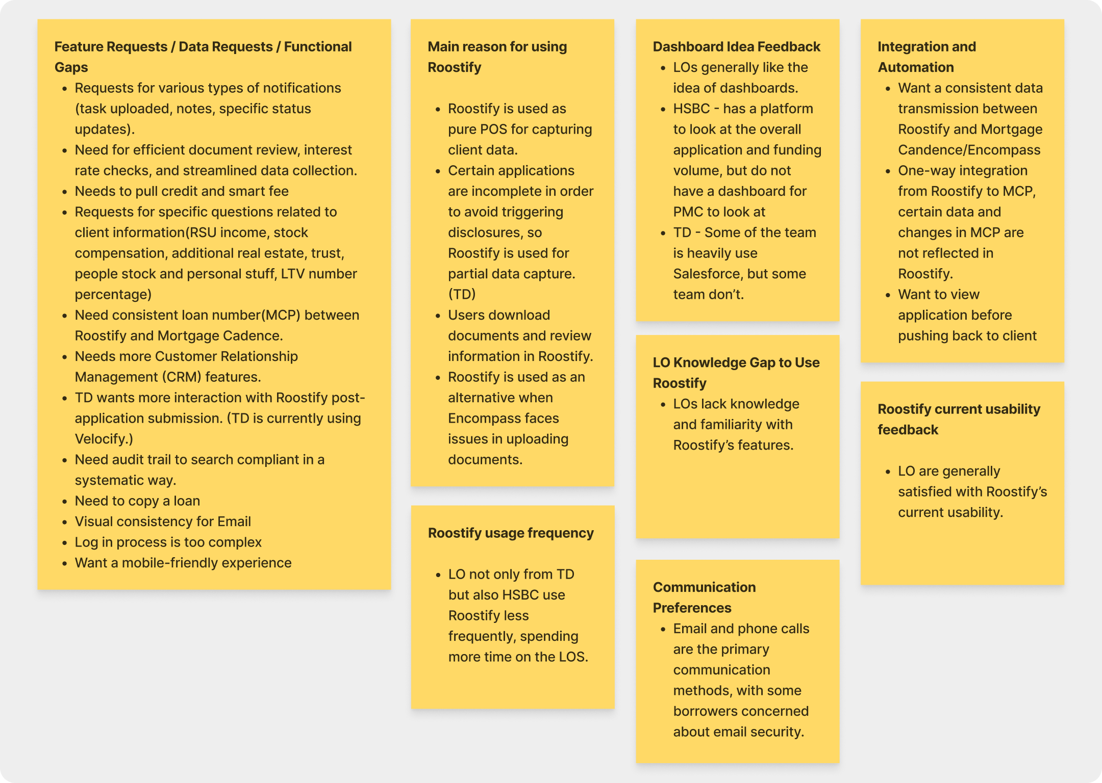
Conducted six rounds of interviews with loan officers from enterprise clients (e.g., TD Bank, HSBC) to understand their workflows, pain points, and priorities.
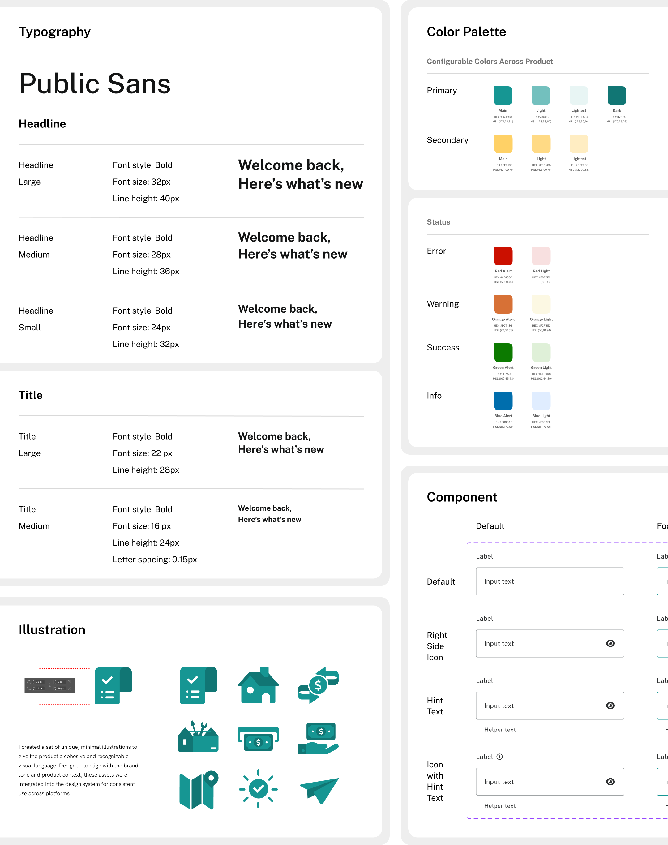
The design system was built on top of Material UI and tailored to the needs of the mortgage ecosystem, creating a unified foundation across App Capture, Borrower Portal, and Lender Portal. I customized components, tokens, and interaction patterns to align with brand, accessibility, and regulatory requirements while ensuring consistency and development efficiency.
• Simplifying compliance-driven complexity: Translated highly regulated, multi-stakeholder mortgage workflows into user-friendly experiences people could navigate with confidence.
• Designing for interconnected systems: Unlike consumer apps, the borrower and lender sides are deeply interconnected. It taught me to consider the full system rather than isolated screens, ensuring touchpoints align seamlessly.
• Adapting design through acquisition: The acquisition forced a shift from startup speed to enterprise scale. I learned how to adapt design strategy to new priorities without losing focus on user needs.
• Communicating design in business terms: As priorities changed, I gained experience presenting design value in terms executives cared about efficiency, adoption, cost savings.
• Growing as a solo end-to-end designer: As the only designer, I had to lead research, design, prototyping, and stakeholder communication end-to-end. This stretched my skills beyond craft into strategy and facilitation.
• Driving impact with limited resources: Limited resources meant not everything could be solved at once, so I prioritized high-impact changes and delivered quick wins to build trust.
